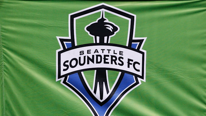
Which one of these Sounders logos is the best?

The Sounders have had many logos over it's proud history but which one is the best?

Seattle Sounders v Chivas USA
Seattle Sounders v Chivas USA | Ric Tapia/GettyImages

Sounders since the start of it's history have only had 5 different logos with it's most recent change being in 2023 with the of course now current logo. But let's have some fun and let's go through all the logos their design and which one's the best!

The Sounders were founded in 1974 a revolutionary time for the whole world in many ways including design. And the debut logo for the Sounders was very interesting! It had a rare combo of darker green as the primary color and very teal blue at the bottom with some white to balance it all out.
They did something genius to make it stand out but not have topo much going on. Which is to have 2 stand out. 1st is the waves to indicate the local area, invoking the Puget Sound that famously sits next to Seattle for years. Then the "o" in Sounders being represented by a soccer ball. which is quite a nice detail. Though I wish they stuck with either invoking the sport of the city also it would've been better balanced with a darker green instead. So overall I like it but could def be improved.

Then in 1983 the Sounders had a logo that was proposed after the original Sounders collapsed and a proposal to be in the indoor soccer league the (MISL) but was scrapped and instead the Tacoma Stars was also proposed but also never happened. Which is a shame because the logo is pretty good. It's a clear remix of the old logo but one where the lean in one direction more than the other. Now it's all blue but one is a lighter not teal but lighter blue contrasted with a very dark blue that works as the primary. This time it's clearly all meant to symbolize the city with a mini dark blue space needle in the background. The soccer ball now a dome meant to represent the Kingdome and keeping the waves at the bottom though now below the dome and leaving the letters alone. I love this logo it's such a shame we never got to use it because it takes everything about the original and improves the flawed parts. The colors are better and now everything is meant to symbolize one thing that being the city of Seattle, it's brilliant.

In 1994 the Sounders were brought back from the dead in the USL (United States League) era of US Soccer with a brand new logo to boot. And it is amazing! I love more complex designs and that's because it takes more skill to balance it all out and that's a skill the designer clearly had! The most standout detail is the ORCA that's heading the ball. Love the detail of the ball being hit with so much power it's got the comic affect all around it. And the aggressive frown it has as if it's on the hunt, it's awesome. We keep the wave aesthetic though minimized with it only being the shape of the transition between the teal and deep dark blue that splits the name and only the Sounders part with the Seattle being tiny and dark blue right above the Sounders part. And below is a part I really don't like about it which is the phrase Professional Soccer and nothing else. Professional Soccer team or club below a logo would already be dumb and too long but at least it's complete. It's not professional soccer, what does that even mean? That you do soccer professionally, I can see that dude, anything else? Aside from that the logo is really great with very creative and well balanced design but it has another problem that all these other logos have as well so saved it for down here. They lack a grandiosity I really love in my designs. I appreciate how creativity a lot of the logos are presented but they're not presented in anyway that's special instead it's like there. This is a problem the next logo solves hella.

Now we get into the logo I grew up with so obviously I have a bias and it is my favorite but I'll go over it objectively. The only symbol of Seattle is the symbol of Seattle the space needle and it's presented in lot more detail than the 83 logo. And towers over everything which is 1 of many ways it shows a grandiosity. Another way is the bridge that spreads itself wide below the needle and proudly has the black Seattle Sounders FC across it. Like it's presenting itself to you proudly and boldly like we should be proud of them ourselves. Then the shields help with that as well making look like symbols of authority therefore it comes across authoritative naturally. Not to mention is more in line with traditional logos in soccer history and understands how and way this design language has been passed through the years. Thus utilizing it greatly. The colors aren't the best I love me some bombastic colors and here they're more subdued. It's extremely well balanced though more so than any of the other logos. With a lot of white, green and blue used in different areas for perfect balance. I'll say the others are more creative and I'll really have to think which 1s better but this will remain my favorite.

Then we come to the current logo as reveled in 2023 and has now become the official logo. And not gonna lie I don't like it at all. It's the least creative out of all of our logos that can't be argued. It's purposely very minimalist because that's the style of the time and it does so by sucking all of life and most meaning out of itself. It still has the space needle I know that and it's good depiction of it. But having it be centered like that lacks the imposing and grand nature the space needle had in the last logo. It also has 19 74 one spaced out on each side of needle like I did to show people the club was founded in 1874, so that's something. Then it's a extremely green shield with a blue outline. So it's also the least creative in terms of colors as well and the least balanced. And because of it's minimalist nature that's all I gotta say and none of it was good.

So those were my thoughts on the Sounders logos based on my standards and interests. Hope even if you didn't agree you found it a fun interesting read and thanks a bunch for reading!